Here were the
Context & Problems
One, of the problems was the original branding of Idelic was not cohesive. Conference banners, the logo, and marketing materials were inconsistent. So, the Head of Product at the time recommended I investigate a new direction.
Second, I noticed everything was indicating safety hazard signs: the Pittsburgh-like yellow/gold and sparse red; the sharply defined edges, and typography. All of which isn't giving off the most comforting feeling.
Here was the
Solution
While also designing the UX/UI for the software, I was investigating a look and feel that would work for both the software and the marketing material.
For the logo I kept the concept of the mountains, roads, and shield. The shield was representative of protection and safety. The roads clearly are representative of the industry. According to the founder, the mountains are representative of driving to the future down the road.
For the color scheme, it made sense to me to use something that would bring a sense of calm confidence, yet boldness. I thought Apple's blue (hex #007aff) would work well with a white background.
For the icon (shield), I used the golden ratio to create circles that would overlap and form the various shapes.
Lastly, the typography was influenced heavily by the UI's new typeface, Roboto. However, the italic version was used to indicate the company's, the industry's, and customer's progress in a safe and profitable direction.
Results for
Logo
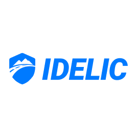
Full logo when light background.
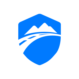
Icon (shield) only when light background.
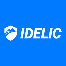
Full logo when blue or dark background.

Icon (shield) only when blue or dark background.