Here were the
Context & Problems
Needs to reflect DK Project Building’s main value proposition: They act as a design AND general contracting company.
Dan needed a website for showcasing past projects, scheduling meetings, and presenting information to clients. The site should allow potential customers to explore independently and offer quick photo access during in-person consultations, which make up about 20% of his meetings.
Projects can have very few to nearly 30 photos, which makes for a lot of scrolling.
Here was my
Approach
I conducted surveys through Lyssna (formerly called Usability Hub) to understand what influences people in choosing someone for a job.
The other purpose of the surveys was to understand the value, as well as the pros and cons, for potential clients of serving as both a general contractor and designer. It turns out that most perceive this as a significant benefit for several reasons: (1) the client doesn't need to communicate with multiple people for the project, (2) they anticipate fewer mistakes due to a streamlined exchange of information, and (3) they believe they will have more control if desired. However, a potential issue arises as most respondents view this arrangement as being quite costly.
In addition, I researched prominent construction companies and studied well-organized UX design/research portfolios for ideas. A robust UX portfolio effectively communicates the process of problem-solving, which is in line with the goals of this construction portfolio. I also delved into presentation software like Prezi to enhance my skills in engaging and retaining audience attention during presentations. After my research, the final design enhancement involved keeping project stage information visible at the top of the screen, with each subsequent stage pushing the previous one out of view for improved user context.
To assess the designs, I conducted 5-second click tests on both the home and other pages. The objective was to determine if the designs could quickly and effectively convey the company's value proposition.
Here was the
Solution
It was evident throughout the site that the terms 'build' and 'design' were necessary to fully convey the company's value proposition. The initial designs for the site included a dedicated section for design decisions per project. However, this aspect was removed from the project scope as the client did not have the time to provide the necessary information.
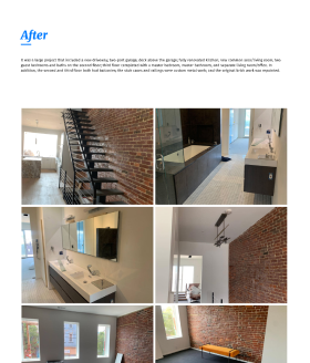
For the project pages, it was crucial to show it as a story, especially for whole-house renovation projects. Similar to a UX portfolio, it needed to efficiently guide the user through the client's needs, pre-renovation pictures (if available), and then present the after pictures along with a description of the solution.
While on a project page, a secondary navigation allowed users to quickly jump to different sections. Additionally, the section headers remain visible while scrolling, providing users with context for the various photos.
Results for
Mobile
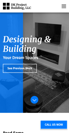
Home page on mobile.
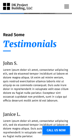
Scrolled down on home page.
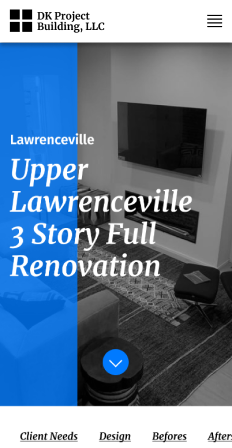
Project page on mobile.
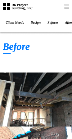
Scrolled down on project page. Sub nav scrolls with user.
Results for
Desktop
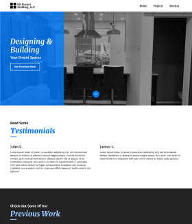
Home page at full width.
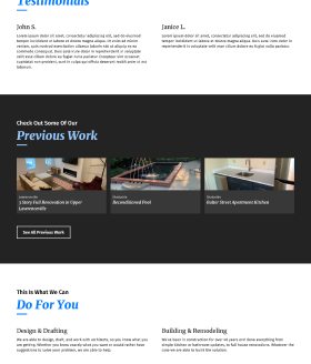
Home page scrolled down.
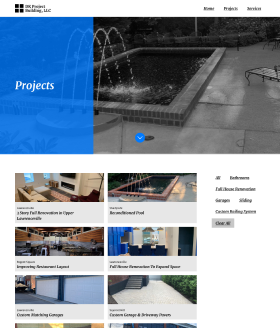
Project list page with filtering.
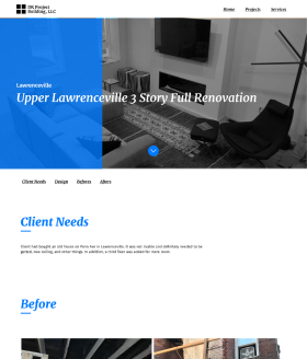
Top of project page on tablet.
Project page scrolled down.