Here were the
Context & Problems
When ordering in person, customers heavily rely on a large menu board that gives very little information and then the cashier.
They offer a unique style of Mexican cuisine that is considerate of customers with dietary restrictions. They needed something that would quickly and easily inform users about the food.
Get people away from Ubereats, Doordash, and other 3rd party apps because it hurts profits.
Here was my
Approach
Throughout my time on the project, I was able to go there and listen for the most common questions from customers, and it became evident that food restrictions were a major concern and a primary reason for many customers to visit. These questions were further discussed with the owner a decent bit and to understand how their type of Mexican food is different than others in Pittsburgh.
To help users with food restrictions, I conducted tests for users with dietary restrictions like vegans, vegetarians, and those with celiac disease. Test results favored a labeled button called "food restrictions" that opened a dropdown menu over using three icons. Furthermore, I tested the website's ability to convey the type of food it offered to users, ensuring immediate understanding, and the design successfully achieved this goal.
Also, I examined popular food delivery apps such as Uber Eats, Doordash, and Grubhub to understand the most effective mobile layouts.
Here was the
Solution
The website originally consisted of a single page with links to their external 3rd-party ordering page. Now, the site design includes a full HTML-based menu, enabling users to access it at all hours and providing a better description of the food. The design prioritizes mobile usage because most users either order through their phones or are standing at the counter reading menu descriptions to better understand the food.
As mentioned above, the click tests showed that users favored the filtering option with more explicit terms. One of the reasons seems to be that users confuse the vegan logo with vegetarian logo. However, gluten free was not a problem.
Results for
Mobile
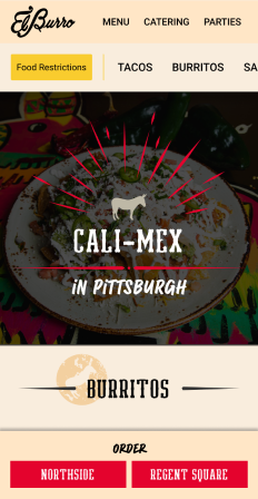
Home page is the menu because it's what users cared most about.
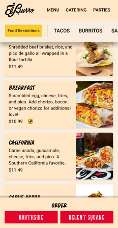
Scrolled down. Top nav and CTAs are fixed.
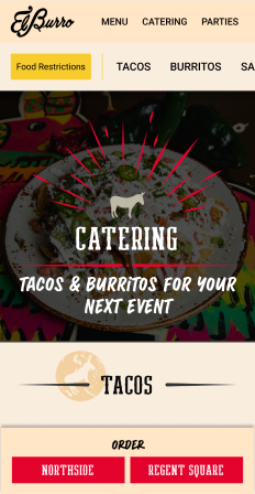
Catering menu followed the same pattern as above.
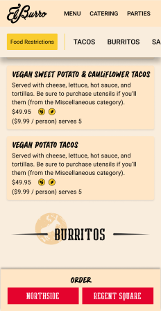
Catering page scrolled down.
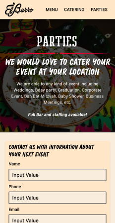
Contact page for parties.